| Kodakery had six variations of its cover design
between the first and last issue, shown below. You can click on any of the covers to
see a larger view of it. The magazine masthead, which also varied over the years, is
also shown. |
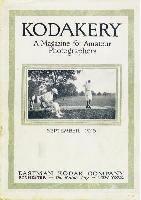 |
The original cover design had a border around the cover
margin. 
|
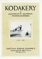 |
The second cover design removed the margin border and changed
the typeface and text layout. 
|
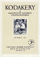 |
The 5ó price was added on the October, 1921 issue. 
|
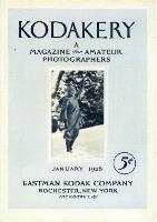 |
Color was added to covers beginning with the January, 1928
issue. The masthead changed slightly in the September, 1927 issue, showing more
modern items, including a Cinķ-Kodak. 
|
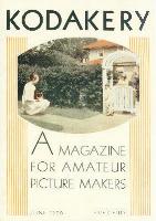 |
Art-deco styling appeared in the mid-1930 total redesign of
the Kodakery cover. "Amateur Photographers" became "Amateur Picture
Makers". 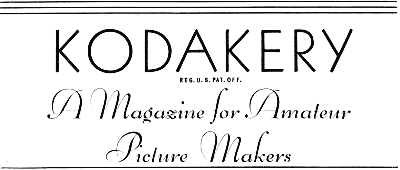
|
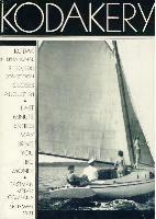 |
The final cover design appeared in 1931. Art-deco styling was
used, but a totally new layout was used. The "Magazine for Amateur Picture
Makers" label disappeared, and a list of feature articles appeared -- much like
today's magazines. Interestingly, the cover once again became monochromatic, which it
remained until publication ceased in 1932.

|

|